Sci-fi interfaces and game design: Building effective tutorials without breaking immersion
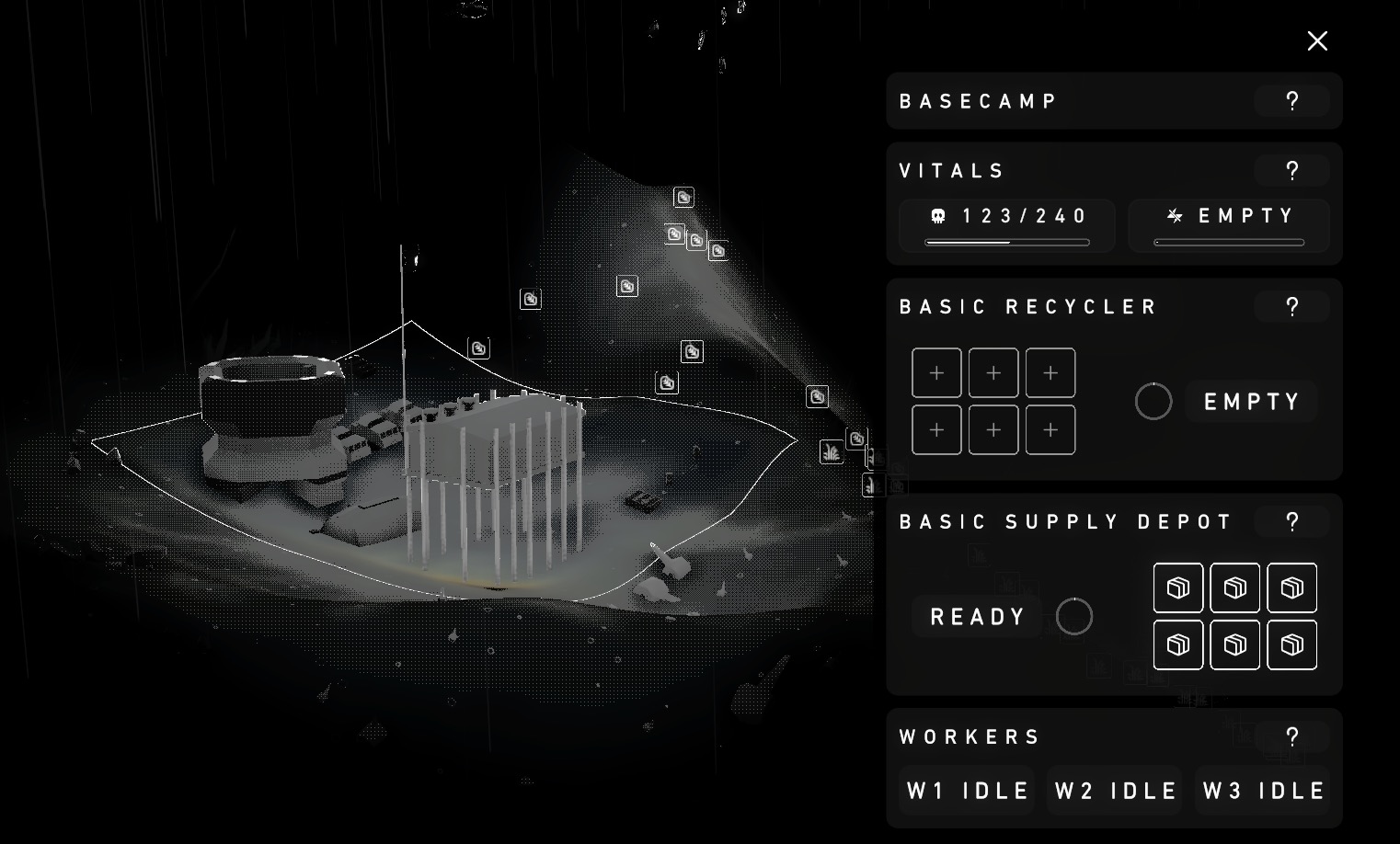
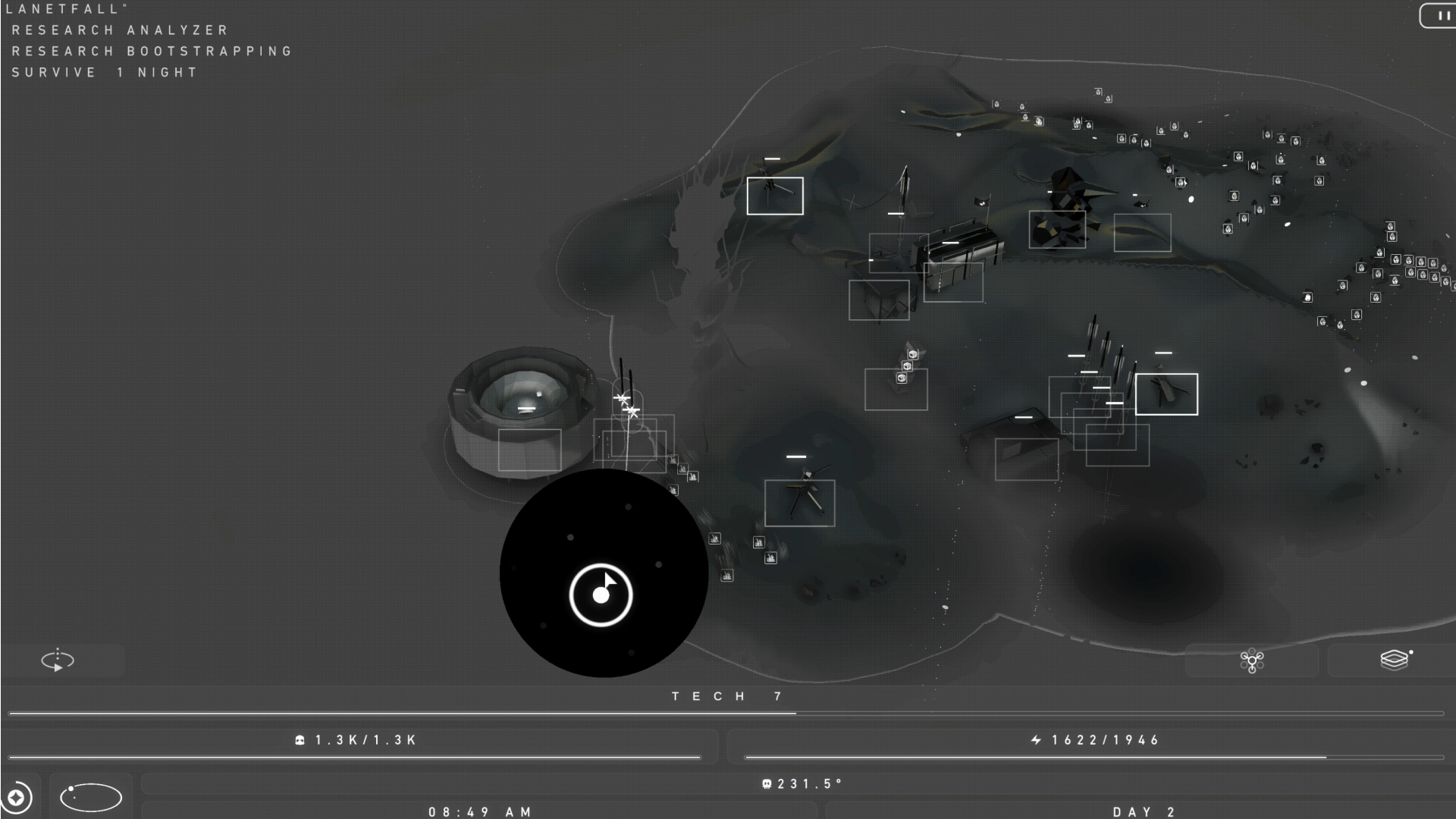
Since the start of Chaotic Era, we’ve always had a distinct vision for the project: We wanted to make a game that felt like you were legitimately using a computer from a sci-fi movie.
From the beautifully retro-futuristic interfaces of Alien and A New Hope to their more modern interpolations in Prometheus, Blade Runner 2049, and beyond. We’ve always been fascinated and inspired by the imaginary machines that flesh out the backgrounds of some of the greatest science fiction worlds put to screen.
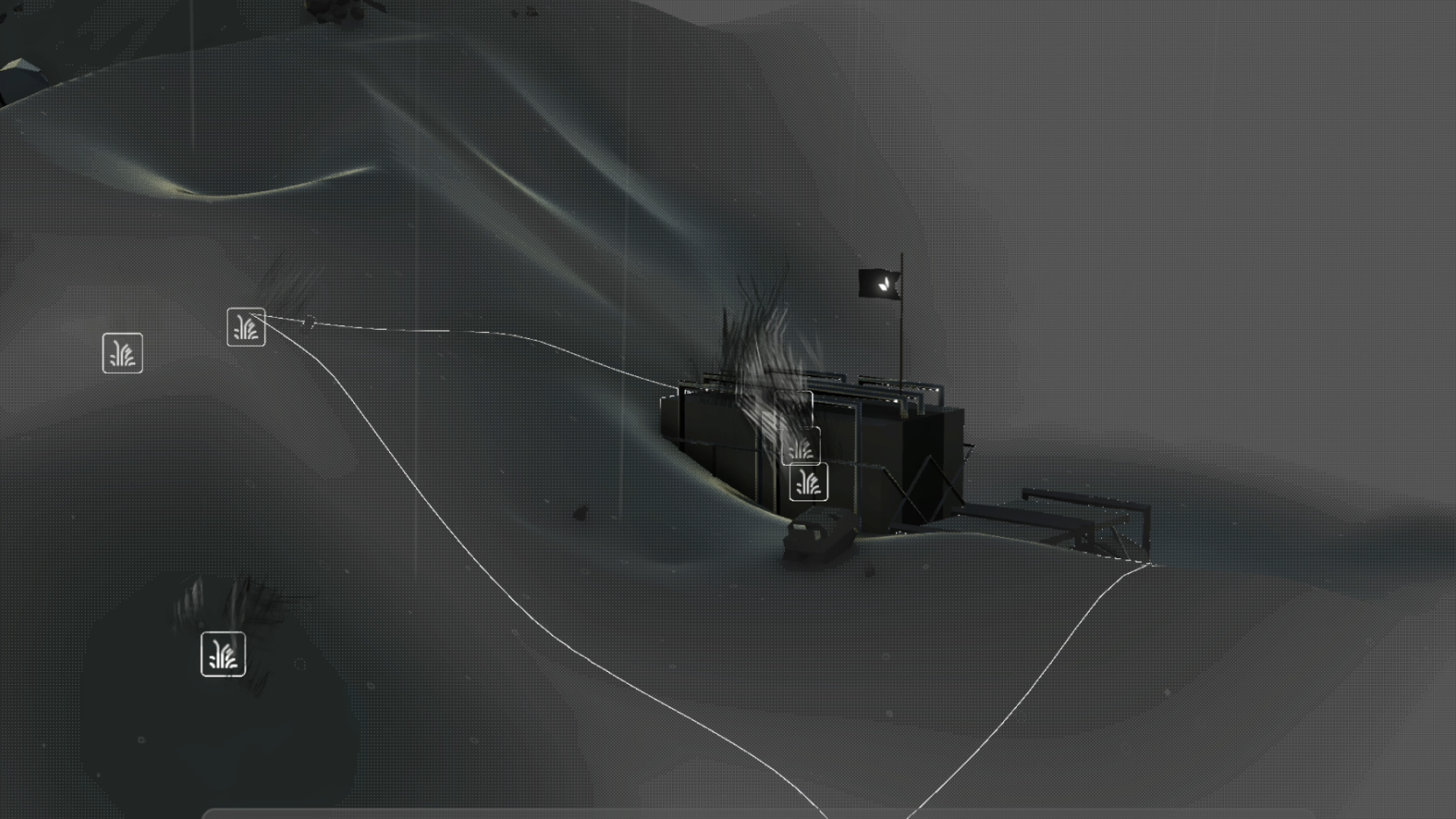
Of course, this vision demanded a game that felt as immersive as possible. We wanted to design Chaotic Era in a way that there were very, very few elements that felt like “a game”; and instead as much of the game as possible felt like how our post-apocalyptic scenario might actually play out while viewed through a computer screen in the year 2790.

From a game design standpoint, this posed many challenges for us—namely, onboarding. For many games, and particularly mobile games (Chaotic Era was initially a mobile-only title), mandatory tutorials have become commonplace. In particular ones that directly guide the player through the core game loop, controlling their path for a set amount of time and introducing them to each element.
Although convenient (and doable within the confines of our vision), we did make a decision early on to forego a tutorial and instead throw the player into the middle of things. We created a scenario—Planetfall—designed to introduce the player organically to the elements of the game and survival, knowing that they would likely fail several times through the course of learning how things work.

Put differently: Given that our game is a simulation of a catastrophic, emergency scenario—we felt a heavily guided tutorial would cut into the immersive aspects of being thrown into a disaster. The panic of trying to figure out how to use a machine while things fall apart around you.
We also, as much as possible, wanted to avoid acknowledging within the game that you were in fact playing a game. There’s a few spots where we made allowances around this—the main menu, objective list, end game screen; just to name a few—but we felt very strongly that a player’s first experience with Chaotic Era being a tutorial would dampen the emotional effect of the game during the player’s initial playthrough.
This meant we took a very subtle approach to onboarding. Hiding UI elements that weren’t yet relevant, using in-universe sound effects to guide the player’s attention, and other very blink-and-you-might-miss-them tactics.

In the week post-launch, we’ve realized this aspect of the game still opened the door for a lot of confusion. And understandably so—although Chaotic Era takes many cues from classic strategy games like StarCraft, Homeworld, and Dune 2; there are many components of the gameplay that do not immediately fit with a player’s schema for how a real time strategy game might or should work.
So, based on the incredible feedback we’ve been getting via our Discord community, we’ve decided to make a few improvements to onboarding in our first major update since the launch of Chaotic Era.
Operations manual—
Much like how we imagine a real world computer in the strange future of 2790, Chaotic Era now comes with an in-game (and in-universe) operations manual. The goal here is to provide the player with the information needed to play the game, and not conceal anything, but still give them the opportunity to figure out how to put this into practice.
Some inspiration for this approach also comes from the beauty of referencing printed manuals that came in chunky 90s PC game boxes.
Tool tips—
To add some optional guidance, we’ve added a Tool Tip icon to every module in the game, letting the player quickly get additional context on what they’re looking at if they’re confused. We saw this as an unobtrusive way to provide information and let the player learn at their own pace.
We also made the inspector menu (the detail view displayed when a unit or tile is selected) position itself dynamically on the screen, rather than being stuck to the bottom and obscuring the HUD.
New player mode—
“Planetfall”, one of Chaotic Era’s available game modes, had been intended originally as an easier introduction to the mechanics of the game. We’ve made that more explicit, so new players understand that this is the case. In the main menu, it’s indicated that Planetfall is best for new players; and we start the match with guidance on how to move the camera and interact with the environment.
More updates— Chaotic Era 0.9.3 also includes lots of bug fixes and quality of life improvements to make the game feel smoother and even more immersive.
We’re continuing to iterate on Chaotic Era with lots of updates and new content on the way as we keep trying to bring the vision in our heads out onto your computers.
The Itch community and our Discord members have been incredibly patient and supportive; we’re extremely grateful and excited to continue to deliver more of the world of Chaotic Era.
BOBBY TECHNOLOGY INC.
Files
CHAOTIC ERA
Atmospheric survival RTS inspired by classic sci-fi
| Status | In development |
| Author | BOBBY TECHNOLOGY |
| Genre | Strategy |
| Tags | Minimalist, Real time strategy, Sci-fi, Space, Space Sim, Unity |
| Languages | English |

Leave a comment
Log in with itch.io to leave a comment.